I'm moving my blog content in house, so future posts will be here:
http://heartwoodcollective.com/infolantern/
Sunday, January 03, 2016
Thursday, October 08, 2015
Digital puppets for halloween high jinx
As Halloween approaches and people look fun ways to entertain trick-or-treat visitors, or something clever for Halloween parties, one cool idea is to use this bit of technology my friend Tim Mallos made - http://www.pixpuppets.com/
It allows you to use your voice and the keyboard to animate a digital pumpkin puppet. Pretty neat
It allows you to use your voice and the keyboard to animate a digital pumpkin puppet. Pretty neat
Saturday, September 12, 2015
Inspiring talk on designing for dying
Beautiful inspiring TED talk by BJ Miller
What we've done with the necessary things of life:
Need for food, we made Cuisine
Need for shelter, we made Architecture
Need for cover, we made Fashion
Strapped to time, we made Music
So, if we also must die, we make .... something new with healthcare that brings increased wonder and love to life.
"Let death be what takes us, not lack of imagination."
Friday, January 04, 2013
fragmented online info
When I was younger I played D&D. I think 1st edition AD&D is
officially what it was, when everything came out in hardcover in 1976
(though I think I started playing in 1978). TSR had some excellent
character sheets, each for a different role, which helped keep
everything in order.
I'm thinking something like these character sheets would be helpful for keeping our online worlds in order...a place to store our personal information
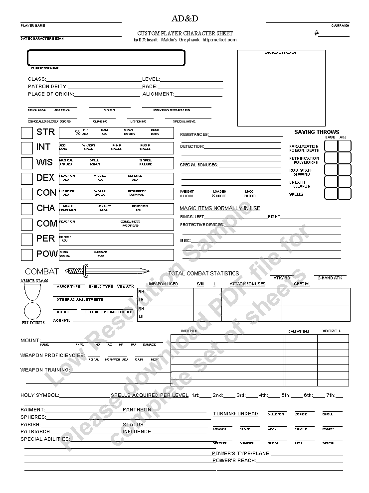
I'm thinking something like these character sheets would be helpful for keeping our online worlds in order...a place to store our personal information
Thursday, January 03, 2013
Neighborhood Nooks

I keep thinking there are all kinds of things that we could put next to sidewalks that would enrich our neighborhoods. I've been drawing bits of things to make & put along the side walk, as places....
- to stop and rest at
- that hold things for sale
- that surface local information (local events, ripe fruit, animal counts, etc.)


Tuesday, September 21, 2010
Preamble
Is no economic growth coming?
Related Videos
Recent decent explanation: http://www.youtube.com/watch?v=UifzEpMjbsQ
Unpredictability of complex systems & concern about the fragility of the current situation and the intensity of possible breakdown: http://www.youtube.com/watch?v=DLFkQdiXPbo
Era of growth is ending: http://www.youtube.com/watch?v=IFag3F1R-zc some other way of organizing economic activity is going to be required, and soon.
Chomsky on the economy: http://www.youtube.com/watch?v=kTtPYM8RSDE
UPDATE: 9/29/2010 the Daily Kos sees something comin... http://www.dailykos.com/story/2010/9/28/906031/-The-Global-Currency-War
Sunday, April 11, 2010
Beard shields
A couple weeks ago on Twitter, the mighty Vaguery sayeth: "@mcburton Alas, the unsuspecting coder at the edge of the pack doesn't realize a Business Development Consultant is lurking in the corner…"
To which there was the reply from the wily mcburton: "@Vaguery my beard will protect me"
That prompted me to remember a conversation that came up at a party while talking to a bearded fellow about how our beards may relegate us to a certain class in society.
On Twitter/Facebook, I asked: How many political or business leaders do you know of that have beards?
1st reply: libbyh : @dcooney bill richardson and al gore sported beards. abe lincoln, of course ;)
From the photos I looked up, I think Al looks fine with the beard.
Replied: @libbyh those are good ones. There are a few academic + business types, such as John Seely Brown or Vint Cerf, but they don't really count.
next:
billmerrill @dcooney don't forget @homelessdave ;)
shadow power
Wednesday, September 23, 2009
down to the margins of the reeds and peer within
Dave Pollard, author at How to Save the World set some of Loren Eiseley's prose to verse.
a difficult re-entry
- The Philosophy of Loren Eiseley, in Verse
a difficult re-entry
The nature of the human predicament
is how nature is to be reentered; how man,
the relatively unthinking and proud creator of the second world --
the world of culture --
may revivify and restore the first world
which cherished and brought him into being.
For what, increasingly, is required of man
is that he pursue the paradox of return.
Yet man does not wish to retrace his steps
down to the margins of the reeds and peer within,
lest by some magic he be permanently recaptured.
Instead, men prefer to hide
in cities of their own devising.
- The Philosophy of Loren Eiseley, in Verse
Friday, May 29, 2009
the challenge of wild eating

Nice story of Becky Lerner planning to go a week on food she can forage from the wild. She needed to cut it short to 5 days, and lessons emerged: plan ahead, work in community.
Friday, April 17, 2009
thinking differently about books
In the past few years, I've noticed I had been considering books a burden of promises.
Though books by themselves don't make any promises, I have been using them as a sort of lifeline to the future: that I'll read that book, and some magic will happen, like I'll know some important bit of information that will make all the difference. Or I realize some secret path. Or I'll be able to offer some new way for my family to interact, or for my neighborhood to become more vibrant, or my experience of nature to be more intimate, or my understanding of history or human society will become profound and I'll be able to ...
Book sellers, authors, and book lovers encourage the mystery and promise of a book, but I'm now finding the majority of the books in my possession feel like items in a to-do list that are always in the low priority group.
After realizing I was doing this, I started to watch for other ways to relate to books. I often encounter situations for which there are not handy words - or even that there might not be words for. I've read enough Heidegger to have tainted my thoughts as to how new language might emerge. Recently I read an article that mentioned the use of a certain theoretical framework, and they called out that framework as something that allowed conversation on a topic.
Once employed, the framework provided by the book "gives us a grammar to..." talk about topic X. I like that.
So, now I find I'm starting to think of books a bit more like a toolset, or vocabulary framework, to employ when thinking about or discussing a problem.
Do I need that tool on the shelf there? If not, should it move aside to make space for tools I do need?
The shift from "unfulfilled promise" to "framework tool" is a great relief.
Monday, April 13, 2009
Local UX events
A reminder that news about user experience events in the Ann Arbor area are regularly posted to UXnet Ann Arbor page. If you want to see a different city, click the "Locales" link at the top, then on the locales page, choose a city close to you.
If you are itching to go to a local developer + UX conference this spring, try Kalamazoo X conference - just a few weeks away.
If you are itching to go to a local developer + UX conference this spring, try Kalamazoo X conference - just a few weeks away.
Saturday, March 21, 2009
IA Summit - Detroit Re-cap Session
For those of us information architect types who are missing the 10th Information Architecture Summit in Memphis (March 20-22), there will be a local recap of the IA Summit at Wayne State on Thursday, March 26th at 11am. There is a write up of the event on the Wayne State ASIS&T student chapter website: http://wsuasist.blogspot.com/2009/03/information-architecture-summit-09.html
Panelists will include Peter Morville, Keith Instone, Chris Farnum, and Heidi Blanton.
Panelists will include Peter Morville, Keith Instone, Chris Farnum, and Heidi Blanton.
Wednesday, March 11, 2009
SI Alumni gathering in A2 on March 12th
Hey - for those who are SI Alumni -
Please join fellow School of Information area alumni as we celebrate this year’s graduating students and welcome them into the alumni community! Let’s show them there really IS life after SI!!
Mix-and-mingle with fellow alumni and meet the soon-to-be graduating students. We’ll be gathering on Thursday, March 12, 7:00-8:30 p.m. in the private room on the second floor of the Cottage Inn on William Street.
Thursday, February 12, 2009
variable interface complexity

or, maybe it should be "variable interface clutter"? I don't know, but I like the idea of turning it up or down - at this site for the Beastie Boys album, Paul's Boutique
http://paulsboutique.beastieboys.com/
(thanks Charlie)
Thursday, November 06, 2008
best display of 2008 election results

The NPR site was easily the best overall presentation of 2008 presidential election results. The user interface there answered questions before they were asked.
Sunday, October 26, 2008
A man of his time
Obama talking about online social networks facilitating a change in power.
got this from Amanda Mooney's blog, via Melida.
got this from Amanda Mooney's blog, via Melida.
Wednesday, October 22, 2008
Candidates tax plans
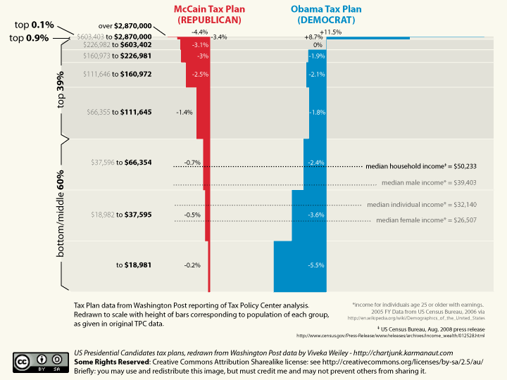 Nice visualization. Be interesting to have a Regan era tax plan up there for comparison.
Thursday, October 09, 2008
Dance of Social Frameworks
Dave Pollard at How to Save the World has a fine post applying his framework for finding people to work with, to the challenge of finding people to live with, assuming living in an intentional community is attractive. Cool. Feels like a post to refer back to.
Wednesday, October 08, 2008
Trusting Computer Generated Advice
Was getting directions to go to a thing.
Went to Google Maps.
was goin' from Ann Arbor, MI to 2600 S Telegraph Rd # 100, Bloomfield Hills, MI 48302
It gave me this:
View Larger Map
Now, if I was doing w/o the benefit of this sufficiently complex magic mapping tool, I would have taken 23 to 14 to 275 to 696 to Telegraph. Sounds simple, compared to what they suggested.
Turns out the path they sent me on was probably a bit faster, wasn't very complex, and had nice scenery.
I had the distinct impression that this was the route a person local to my destination would have suggested. It even had us coming up to the driveway to the building from behind the building, so we didn't see the business sign - just trusted the directions given.
I was impressed by this. And I wasn't alone. A couple other people had a similar experience - taking the same route suggested by The Goog. My favorite comment came from Les Orchard who said "I feel like I just gained experience points."
It was freaky. A revealing of what would have otherwise been "localized knowledge". I like benefiting from that. But it does make me feel drawn in, and this triggered some defenses. Do I trust somewhat wacky directions in the future? When I get this information from a human who lives where I'm headed, I trust. When it comes from a data crunching machine, what then? Trust?
All these roads we drive on are connected (other than some closed, corporate road correlate to the "dark web"), so it makes sense using that assumption that one should be able to just find the shortest path based on knowing the localized rules. So, I guess trust of certain advice coming from computers is bound to increase as it improves. Slippery road, trusting computer advice. Thar be dragons. (...but dragons give good experience points, hmmm...)
Thursday, September 18, 2008
visualizing items in categories
Someone on an IA mailing list I'm on was asking a visualization question. They wrote:
Compelled to reply, I wrote:

I'm planning a project where participants will grade example items according to how well they fit their idea of what a certain category is. The grading will be on a 1-10 scale, similar to the (in)famous hot-or-not grading system.
I anticipate about fifty or more items to be tested, and for there to be a range of agreement. What data visualisations formats could I consider for showing this?
Compelled to reply, I wrote:
Will you want to show items spanning multiple categories? I'm trying to sus out what you want to get out of this. I'm guessing you want to present back to someone(s) evidence for what categories make sense re: their set of items.
Of the 50 or more items, perhaps another dimension could be the importance of the item to the stake holders. Ex: the items that either make the most $ for the stakeholders, or are the most valuable for their mission, etc. would be "higher" value than other items.
If you could determine that, then you could make that the up/down dimension, with the top being "higher" value items. If you showed the categories as columns on a 2D surface, all with the same width, then placed all items on that surface in top/down order (could think of them as sorted rows on the sheet), leaving space to one side of each category... ah I should just make a picture... OK, attached is a picture.

The picture just shows the top items, but I presume your final visualization would include all items. Each "row" is an item. If it shows up multiple times, that's because it was considered to be more than 50% within the category (or some rule you will come up with).
You could show items that fell further outside that threshold, but only show them dimly. Or show all items with their transparency set to the percentage they were within the category. (if you do that, still show the physical placement of the item in relation to the category, as that is easier for us humans to pull data from.)
An important indicator of success for the categories would be if the top priority/value items all fit snugly into one (or more) categories. It might be ok if lower value items didn't fit the categories as well.
Subscribe to:
Posts (Atom)